I have been thinking about a new visualization for sports league standings. Something that you could use to see teams on the ascent, and teams on their way down. Ideally, this would include all of the teams in a league, but since it takes a bit of time for me to prepare the data, I figured I would start by sharing the a micro-set of data, seeing whether this visualization already exists somewhere, and, if not, whether you find the visualization intriguing.
If you click on the image, you can download the Excel spreadsheet that I used to create the chart.
What you are seeing is the 2016 season of wins and losses for the Seattle Sounders (red) and the Portland Timbers (orange). A win is worth +1, a loss is worth -1, and a tie is worth 0. For the first game, you see that the Sounders lose and the Timbers win.
Some interesting things jump out from this visualization: the teams are in a dead heat from games 8 to 13, the Timbers are on top for most of the rest of the season, and around game 25 the Sounders are in the toilet. But, you have to get hot at the right time, and that is exactly what the Sounders did: advancing from -4 to +1 over the course of the last 9 games.
Summary of the Simplified Startup Business Framework: CP Squared
Customer, Pain, Competition, Product. Create something that optimizes across these 4 dimensions, and you have a great shot at building a meaningful company. Fail to deliver something that satisfies your customer pain 10x better than the competition (or for 1/10th the price), and you are on your on a well-trodden path to failure. Use this super-simple form to model your business, and ensure that you understand your fundamentals before you do anything else.
CP Squared Framework – click to expand
Background
I have been focused on startups since 1999, when I had an idea that was going to change the world. Unfortunately, I had absolutely no idea what I was doing, and there was no framework for helping newcomers like me understand how to build a startup.
In 2003, Steven Blank published “Four Steps to the Epiphany.” In 2008, Eric Ries built on Blank’s framework and published the “Lean Startup.” In that same year, Alexander Osterwalder released the “Business Model Canvas,” a framework for visualizing your startup business model.
I relied on these tools extensively in 2012 when I was the Managing Director of the Microsoft Accelerator powered by Techstars. And we had some pretty amazing success: 1 startup from the 1st class was acquired within a month of demo day, and another startup has raised over $45 million. Despite these successes, a number of the startups struggled, and some of them failed. After the Microsoft Accelerator, I shifted back to building my own startup called Payboard, where I hoped to make websites intelligent. Unfortunately, I also failed. Overall, I have been involved with approximately 50 different startups, and a vast majority of them have failed. And for the startups that did not fail – it was as much luck as skill, and some of the startups that had the most skill on their team ended up failing. I have spent the last few months thinking about why failure happens, why success happens, and what can be done to improve a startup’s chances of surviving and thriving.
What is the Problem with Blank, Ries, and Osterwalder?
The problem with building a startup using existing frameworks is that there are too many #1 priorities. You need to build a great team. You need to be in a growing market. You need to raise money, and raise it from the right investors. You need to take care of the noise (like incorporation, and employment agreements, and software license agreements, and payroll, and SEO, and invoicing). You need to do 1,000 essential things all at once, and it is easy to get lost in those weeds and gloss over the fact you do not have a solid foundation (yet).
Let’s take a simple (and painful) example where I took an absolutely wrong path, which eventually lead to my and my startup’s failure. About 1 year into my startup, Mat Ellis (who has been able to build an awesome company called Cloudability – and it was not luck!) told me to stop what I was doing, and go figure out who my customer was. I heard him. I still remember the conversation very clearly. But I had so many other priorities going through my head that I did not listen.
Actually, it was worse than that – I listened and I understood I was wrong, and I drove on despite knowing that he was right and I was pretty much just digging a deeper grave for my startup. Why? I calculated that if I took Mat’s advice and I really focused on who my customer was, I would disqualify most of the companies that were presently interested in working with us (including pilots like Microsoft and Moz), and that would completely destroy our fundraising efforts. So I forged on, as many a startup has, to put one foot in front of the other and keep making “progress.” We landed pilots with Microsoft and Moz and a dozen other high-profile companies, but because I did not have my customer clearly identified, and the pain that I hoped to resolve for the customer nailed, I was basically doing underpaid consulting work. 1 year after the conversation with Mr. Ellis, my startup was dead. 2 years, untold hours, and a kick-ass startup idea wasted. Bummer.
I am not alone in failure. In fact, I think failure in tech startups is far higher than the 90% estimate. But even assuming it is just 90%, that is still too high. With as many problems that need solving, we need more startups to survive and thrive, and make money solving the most challenging problems on the planet. Even if your focus is not cash, you need to make enough money to fuel growth so you can help more of your customers. And if your startup needs non-familial investors, do not fool yourself: your focus is cash.
The Solution to Startup Failure
To this end, I would like to propose a simplified startup framework called the CP Squared Framework: Customer, Pain, Competition, Product. 90% of your time and energy should be focused on the Customer+Pain loop. If you can articulate with specificity who your customer is, and what pain they have (and back this up with 30+ customer interviews where they are telling you they have this pain), then I believe that your odds of reaching escape velocity are 10x greater than the average startup.
Once you have a locked in Customer+Pain, then you can start evaluating your Competition+Product. Typically, we start with our product. This is natural because we want to build something. But, in order to build something of significant commercial value, you have to learn what your competition has already built. If you are a startup, and you build something just as good as the market leader, you will fail. Even if you make it 10% better or 10% cheaper, you will fail. If you are building something new, you have to achieve either 10x performance (e.g., your product is 10 times better, aka transformational) or 1/10 the price as the market leader. Nobody is looking for a nice to have feature from a startup, or a little bit of cost-savings – there is simply too much risk in working with a startup to justify these nominal returns.
One word of warning: the size of your existing market is limited by the value of the competitors’ revenue selling their product to the specified customer to address the specified pain. So if your competitors are making, in aggregate, $10 million a year selling competitive products to your target customer to address your specified pain, the most you can hope to make with your market-dominating product is $10 million (assuming you take 100% of the market – probably not likely). Sure, once you are making $10 million a year, then you can have a huge team doing a number of different things and you can educate customers that they SHOULD be doing something that they are not currently doing. But to start you need to focus on the competitors that are currently in the marketplace, and how you can grab market share from them. If there is not enough competition (that you can dominate) that is currently making money that should be yours, you are going to a near impossible journey.
Don’t measure a market by what potential customers SHOULD be buying. Measure a market by what customers ARE CURRENTLY PAYING FOR.
You can think of this as a simplified business model canvas, but I actually think of this as a complex business model canvas: since you have fewer irrelevant blocks, you actually have to get super-clear on the blocks that matter. A simple and effective plan is far more difficult to build than a complex plan. Agreed?
If you would like to discuss how this framework could apply to your startup or business, please grab some time on my calendar at https://calendly.com/mdyor/30min/.
Thanks, and have a great day.
Matt
Ps-If you think that you are not a startup, either because you are in a big company, or you have been around for a long time, you might be wrong. My definition of a startup is an organization that is looking to transform an income statement – something on the order of 10x increases in revenue.
A startup=any company (or team w/in a company) that wants to increase revenue by 10x. If startup, then discovery (not optimization) is goal.
Despite the power of data discovery tools like Qlik, Tableau, and Power BI, a vast majority of businesses are failing in their efforts to become data driven. Qlik estimates that for their existing customers, there is only a 25% adoption rate (Qonnections 2016). That means that even for companies that have invested in becoming data driven, 75% of their employees are just winging it. Without the right data in the right format for each type of business user, these businesses can end up with entire departments that are not benefiting from data discovery.
There are 2 core reasons why this adoption rate is so low: 1) the right data is not available at all within the Qlik environment; and 2) the data that is available within Qlik is not refined in such a way that it can be useful to the 75%’ers.
If you are struggling with these challenges, you should check out TimeXtender (disclaimer: TimeXtender is an awesome company; disclaimer 2: I work for TimeXtender:). TimeXtender provides software that gets complex data into Qlik, and enables business intelligence (BI) teams to integrate, join, cleanse, denormalize, and otherwise refine the data for each business user. TimeXtender does the job of 3 tools: ETL software (like Informatica and SSIS), database management software (like SQL Server Management Studio), and semantic modeling (like Qlik Data Load Editor). Not only does TimeXtender do the work of these 3 tools, but it does it without required BI teams to write a single line of code.
If you are struggling to increase adoption of data discovery tools like Qlik within your organization, consider whether you are providing all of your users with the data they need and in the format that makes sense to them. If not, take a look at TimeXtender.
As a patent attorney, I have something to admit: understanding patents is not as valuable as understanding copyright and contract law for software people. This may have been different a decade ago, before cases like Alice put software patent law squarely in the “nobody knows the rules” bucket. But I think that the changes in case law have only accelerated the shift in importance, and that copyright and contract have always been the driving forces for software.
Why is Copyright Law Important for Software Companies
Did you know that whoever writes software, by default, has rights to that software under 17 USC Section 201(a)? You have a brilliant idea, tell a contractor or employee what you need to happen, pay him or her handsomely for their time, and…they own the rights to the software.
Unless you contractually (and up front) negotiate rights to the software, the person who wrote the code can end up in a position where they can sell the code to a 3rd party, such as your competitor. Bummer.
Why is Contract Law Important for Software Companies
Think of contracts as legal systems that operate between the parties of the contract. So, if you do not like the default behavior of the US Copyright laws, you can enter into a contract where you define how rights are shared between the members of the contract. Instead of petitioning Congress to create a smarter system, you write up your own rules.
The first thing you should do is, for all of your employees and contractors, have them (as part of their employment agreement or a specific engagement agreement or statement of work) assign their rights in any copyrighted material to the company. Because this is done before wages are earned or fees are paid, there is consideration for this transfer of rights from coder to company.
Second, you can agree that any work that cannot be assigned to the company was created as part of “work for hire” arrangement. You can learn more about a work for hire in Pillsbury Law’s article entitled “Work Made for Hire does not Generally Apply to Computer Software.” In short, work for hire grants employers additional rights, but may also create rights beyond the expectations/desires of the parties (particularly in California, where an employee relationship can be created when works for hire contracts are in place).
Conclusion
In short, the most important priority to keep in mind when hiring employees or contractors to write software is to have a framework in place that AS CLEARLY AS POSSIBLE lays out the rights afforded to each party. Most software developers understand that, when they are working for a company, the company owns that software. By creating a contract that reflects this understanding up front, confusion down the road can be eliminated.
If you have ideas about how to protect either software companies or software employees, I would love to hear about them.
I was trying to figure out whether the Twitter API allows you to get “click” counts via the API. This information is available via Twitter app (Tweet activity as “Link clicks”), but I did not see it as part of the API.
Does the Twitter api allow you to see how many times a tweet has been clicked? I see favorites and retweets:
It looks like Twitter has made an interesting decision to have this as a commercially, but not publicly, available part of the API (e.g., you can get it via Gnip).
I am hoping that there is some way that Twitter has provided to pull this data (perhaps the Analytics API?). But, as a short-term fix I am going to try this:
The Twitter API will give me the retweets and favorites, and the Bitly API will give me the clicks.
I will write a follow-up based on what I learn. I am curious to see whether stitching together this data from multiple APIs introduces some noise, and whether masking links with Bitly decreases clicks (e.g., a greater number of hops => increased time to hit the destination page, people may be afraid of masked Bitly links, etc).
If you have a better way, I would love to hear it.
Have you ever dreamed of being able to visually explore your data? If you have, Qlik is your dream come true. Qlik, and in particular Qlik Sense, allows you to perform data discovery on just about any data set with relative ease. In this post, I am going to walk you through my favorite way let Qlik help you create valid relationships between tables in an unfamiliar data set. All told, this article should take 5 minutes to read, and less than 30 minutes if you are following along with the actual Qlik app.
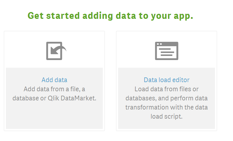
Qlik’s First Question: to Add Data or Not to Add Data
Whenever you create a new Qlik application, you are presented with an option of “Add Data” and “Data load editor.”
The way I think about these differences is that “Add data” is easy, and “Data load editor” is for people who enjoy punishment (they will claim that they prefer greater control over the import process). Both approaches have their strengths, but if you are just looking to jump in with both feet and start exploring your data, I would start with Add data.
If you want to play with a simple dataset, you can download this Excel file that I created to demonstrate some of the fundamentals of adding data to Qlik Sense. I will be using this data for the rest of this post.
Associate Data in Qlik Sense
After you add data, you are going to be slapped in the face with a simple truth: Qlik Sense, which allows you to bring visual meaning to very complex data, has some very complex user interface (Qlik is radically improving this in Qlik Sense 3!). Unless you are just dealing with a single set of data, the first thing you need to do after adding data is associate the data you added. Here is a screen shot that you are presented with…do you see how to create the relationships between your data? Of course you do! It is that little tiny “Associations” button at the bottom of the screen. 🙂
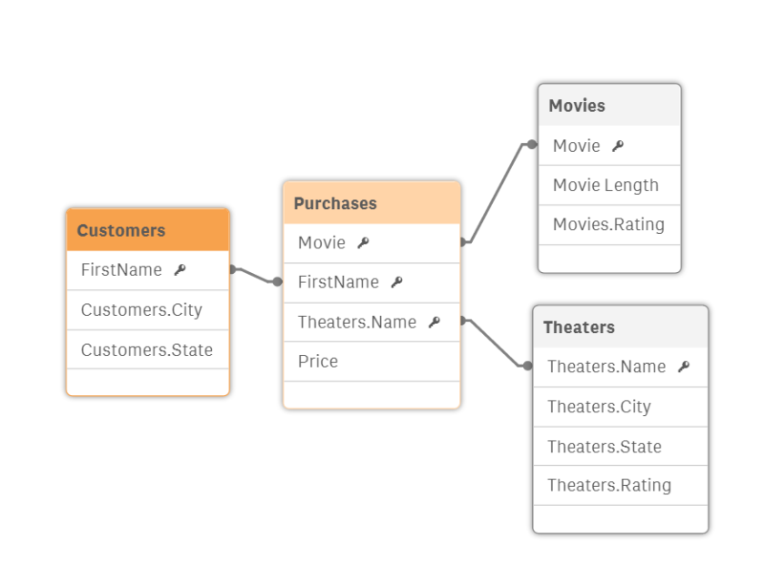
Once you have clicked on the Associations tab, you are presented with an option to associate each of the tables together. For each table to table relationship (e.g., Customers – Theaters), you need to select either “No Association” or one of the recommended associations. For the Customers – Theaters combination, there is no relationship, so you select “No Association” and then select the down arrow to advance to the next table.
NOTE ABOUT OVER-JOINING: Notice how Qlik recommends the association between Customer and Theater with 100% confidence. There is no relationship between customers and theaters (a person can purchase a ticket at any theater, and the only proper relationship is through the purchase entity). But, because Customer and Theater both have a city field and these have the same values, Qlik recommends a relationship 100%. I still love Qlik for recommending these joins, because it is a lot easier to see a recommendation and determine that it is invalid than having to try to imagine what relationships might exist – particularly on a large and complex data model.
Now that we advance to the Purchases – Theaters table, we see some pretty amazing smarts on display by Qlik: we have the purchaser’s name as “name” and the theater’s name as “name” – but a person’s name (e.g., Matt) is not the same as a theater’s name (e.g., Regal 8). Qlik recognizes that the proper join is between Purchase.Theater and Theater.Name and suggests this association with 100% confidence.
After you go through all of the possible associations, you should have a pretty good object model.
And if you switch over to the Data Load Editor, you will see a nice clean script that Qlik created for your data.
[Theaters]:
LOAD
[Name] AS [Theater],
[City] AS [Theaters.City],
[State] AS [Theaters.State],
[Rating] AS [Theaters.Rating];
LOAD
[Name],
[City],
[State],
[Rating]
FROM [lib://Desktop/Movies.xlsx]
(ooxml, embedded labels, table is Theaters);
[Customers]:
LOAD
[FirstName] AS [FirstName],
[City] AS [Customers.City],
[State] AS [Customers.State];
LOAD
[FirstName],
[City],
[State]
FROM [lib://Desktop/Movies.xlsx]
(ooxml, embedded labels, table is Customers);
[Purchases]:
LOAD
[Name] AS [FirstName],
[Movie] AS [Title],
[Theater] AS [Theater],
[Price] AS [Price];
LOAD
[Name],
[Movie],
[Theater],
[Price]
FROM [lib://Desktop/Movies.xlsx]
(ooxml, embedded labels, table is Purchases);
[Movies]:
LOAD
[Title] AS [Title],
[Movie Length] AS [Movie Length],
[Rating] AS [Movies.Rating];
LOAD
[Title],
[Movie Length],
[Rating]
FROM [lib://Desktop/Movies.xlsx]
(ooxml, embedded labels, table is Movies);
I have worked with Machine Learning off and on for the last couple of years. Unfortunately, it is not part of my day job, so I need to find ways to integrate machine learning into an already busy day and week.
I stumbled across Datacamp, and so far I love what I see. After creating a free account in about 10 seconds, I was watching my first sub-10 minute video. Yes, no biggie there, but that is where it gets great: Datacamp starts providing an interactive R session, along with detailed instructions and readily available datasets, where you can actually start doing your very own work – no software required. Pretty impressive.
I would love to know more about Datacamp: who are the founders, what is their business model, and how did they get so awesome? If you know the founders, please drop a comment below.
Thanks, and if you end up testing it out let me know what you think!
Here is a post from my good friend, Dharshan Rangegowda, Founder and CEO at Scalegrid. Check it out. And if you are looking to host Mongo on AWS, give him a shout. He will take care of you!
Mongo’s flexible data model => developer’s best friend. Cassandra will help with scale. Good read https://t.co/1PPb06Vqp7
When I was an IT contractor for the Marine Corps in Washington DC, the summers could get pretty hot. The only respite from the heat was, you guessed it, the server room. Sometimes, I would just fire up one of the servers and do some research on a web browser to bask in that high-powered AC (please do not tell anybody). The biggest problem from my IT worker perspective was that when the AC went down or some other piece of hardware decided to die over the weekend, one of us would have to drive in and fix it.
Fast forward 10 years, and the days of the boutique server room seem to be drawing to a close. Companies are moving to public and private cloud at an accelerated rate. There are a number of benefits to moving to the cloud: shifting capex to opex, just-in-time capacity, and not having to come in on the weekend when the air conditioner goes down.
But what does that mean for on-premise software – software that used to operate inside that soon-to-be-shut-down boutique server room? One trend I am seeing is that companies are shifting on-premise software to the cloud with a Virtual Machine (VM) architecture. Granted, there are differences between a purpose-built cloud offering and a VM-based cloud offering, but it seems that the VM architecture is the optimal approach for companies that have invested time and money creating valuable on-premise software.
With a little bit of creativity, companies can realize all of the key benefits of the of the cloud (e.g., no on-premise footprint, opex, just-in-time capacity, subscription-/consumption-based pricing, and not having to come in on the weekend when the air conditioner goes down), and these benefits are realized without having to throw away a valuable piece of software that is already delivering value to customers.
Deploying TimeXtender on an Azure VM
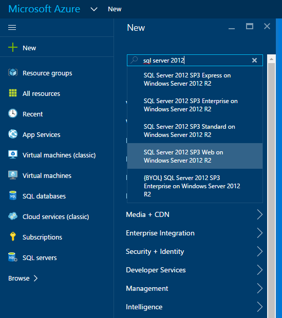
Let’s get to the Technical Part. I assume that you already have an Azure account. The first step is to create a new SQL Server VM (not a SQL Database…that is for Azure SQL, Microsoft’s SQL as a Service offering). I chose SQL Server 2014 SP1 Standard on Windows Server 2012 R2.
Accept the defaults when you create this VM, but make sure that you write down the username and password that you use to create the VM, because you will log into the VM with this information. I did use a resource group instead of the Classic VM, because I think that is the direction Microsoft is heading.
For the VM sizing, I chose DS1_V2 mostly from a cost perspective. It costs me $104.16 a month, so I can leave it spinning on the cloud for demos without burning through too much budget. This is not going to handle monster workloads, but particularly if you are just exploring TimeXtender and building super fast data warehouses/data discovery hubs, it will have enough muscle for your needs.
For the SQL Settings, select Public – assuming that you are going to want to consume data from your data discovery hub from other machines (e.g., a Qlik application). For the port, you can stick with 1433 or you can be sneaky (just be sure to remember your sneakiness when trying to connect to your database).
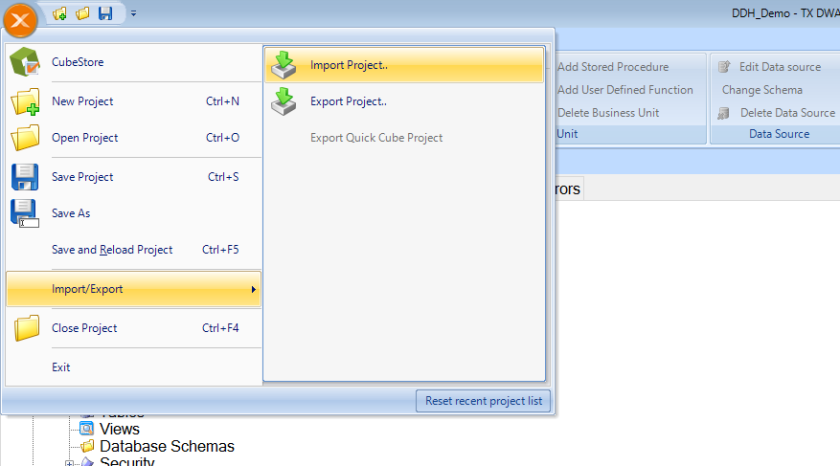
Now let’s get started. My preferred approach is to grab a copy of the Data Discovery Hub template, Import the Template as a new project, and Run the Connection Wizard.
Let’s start by importing the project. First, download the Data Discovery Hub template at https://dl.dropboxusercontent.com/u/19691948/DDH_Demo.XML. Place it on the desktop of your VM. Then open TimeXtender and select Import/Export, and then Import Project, like this:
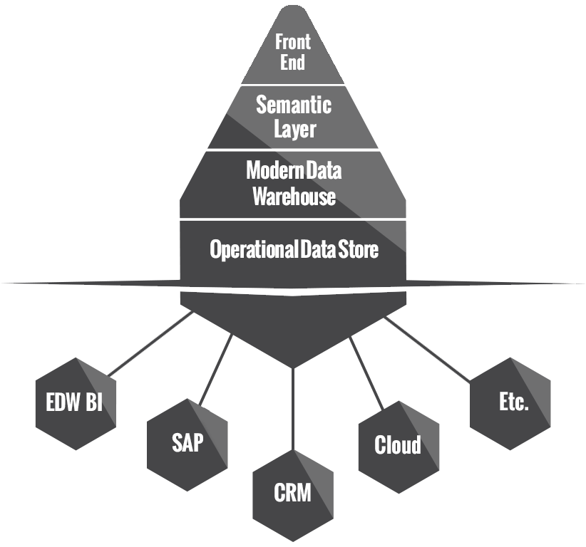
As soon as you import the project, run the connection wizard. You will see that there are 4 different connections: ODS, Stage, MDW, and Dynamics. Dyanamics represents an existing Dynamics database. The other 3 (ODS, Stage, MDW) are part of the data discovery hub. This is the data repository that we are going to create to store our Dyanamics data.
In short, the data discovery hub includes the ODS (Operational Data Store) where we land non-transformed data right out of the source, the Stage Data Warehouse where we do our transformations and denormalizations, and the MDW (or Modern Data Warehouse) where we house the “business ready” data. Power Users can be granted access to the ODS so that they have access to all data across the enterprise and can conduct unfettered data discovery. The MDW is used to populate Qlik (or other data visualization/front-end systems). The data discovery hub is the most effective way that I have ever seen to get world class data to all employees within a company.
But I digress…let’s get back to setting up our system. When we run the wizard, it will first ask us where we want to store our ODS. Keep the defaults, but you have to click the “Create” button before hitting OK to actually create this database on your machine. Once you hit “Create” then you can hit OK.
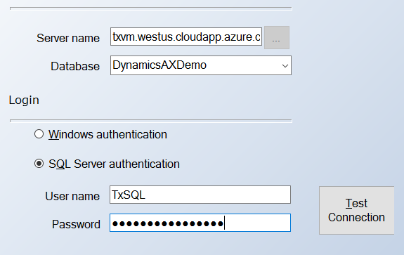
Next, the wizard prompts us to connect to a Dynamics database. You can either connect to your own Dynamics database, or you can connect to a sample database we are hosting on Azure. To connect to our Dynamics database, the server name is txvm.westus.cloudapp.azure.com, the SQL Username is TxSQL, and the SQL Password is TimeXtenderRocks! (with an exclamation point!). Your wizard should look something like the image below.
Notice that there is no option to create this database, because we are pulling data from an existing data source, not creating a repository where we can store data.
Run through MDW and Stage (do not forget to click Create for ODS, MDW, and Stage!), and then click the Test Connections button on the wizard. Everything should be green, like shown below.
For starters, I have just created the Data Discovery Hub architecture, and I will leave it to you to pull tables into your ODS, structure tables from your ODS into business ready data in your Stage DW, and then present business ready data to your business users in the MDW.
If you have any problems with any of these, let me know!
I have been hearing a lot of great things about Power BI recently, so I decided to take it for a spin. We use Hubspot at work for our CRM, and Hubspot does not have meaningful reporting (sorry Hubspot). For example, you cannot create a report for all of your active deals in a particular location (e.g., to figure out who you should visit during a trip), because deals do not have a location – they have an associated company that has a location, but there is no way to “chain” (or denormalize) data in Hubspot.
Download Power BI
Instead of lamenting, I decided to get to work with Power BI. Simply head to this URL: https://powerbi.microsoft.com/en-us/get-started/ and select “Download” on the left.
A minute or so later, and I was ready to roll. Now, what I did was export my Deals data and then my Companies data from Hubspot, import this into Power BI, associate the Company>Name and Deal>Associated Company, and then add these to a map. Super easy, but too much for an intro to Power BI, so let’s just create some interesting data that we can visualize with Power BI.
Enter Your Travel Data
After my download completed, I opened Power BI and clicked on the Enter Data icon on the Home tab at the top.
This allowed me to enter the countries I visited, and the years I visited those countries, into an Excel like field.
For all that I love about Power BI, this seemed to be a weakness: you cannot add content to the text of the pin. For example, when I hover over Ecuador, all I see is Ecuador. I cannot add the year that I visited Ecuador in any logical way. What I did to overcome this was to drag the year into the “color saturation” column, and this adds the year to the dropped pin hover text (it also changes the color intensity, but not in a way that is noticeable). You should end up with a view like this when you hover over Ecuador:
Finally, it is always good to have a listing of your data outside of your map. I did this by clicking on the table field and then adding the Year and the Country (note: I do not think that you can chose the order of these fields, so if you chose Country as the first column you will end up with an alphabetic listing of countries, and there is nothing you can do to change this…and that is why I put year first so that Power BI defaults to order by year…which kind of makes sense here)
And that is a pretty fun map that you can go ahead and share on social media, like I did here:
Using #PowerBI to visualize the countries I have been lucky enough to visit. Very impressed by the ease of use. pic.twitter.com/deWeqMStaY
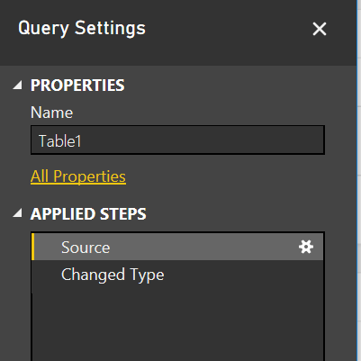
Everything is easy once you know how to do it, but when I first tried to change the data that I entered into Power BI’s “Enter Data” interface, I was a bit stuck. Here is what I did: click on the elipses next to Table1 on the right side under Fields, select Edit Query, and on the right side of the modal window that pops up, I selected the gear under Source, which is under Applied steps. Seems a bit tricky, so if you have a better way, lemme know!
Initial Impression of Power BI
Overall, I am impressed with Power BI. It is powerful, and it is affordable, and Microsoft has made it very easy to experiment with. If you end up creating a map of the places you have been, let me know so I can check it out!